Greetings, 👋
Today, we are exploring two distinct wireframe versions we’ve designed for the game’s new User Interface (UI). Everything’s still a work in progress, but we’d love your thoughts on these wireframes and couldn’t wait to share them with you.
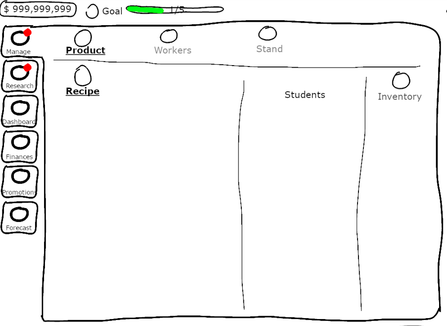
Version 1
The first version employs a detailed yet intuitive home screen, showcasing the primary action sections and the environment in a fixed view. With tab-like functionality and a mix of new and existing features, the design focuses on user-friendliness.
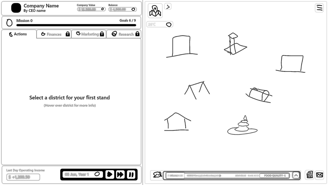
Navigation and Gameplay 🗺️
The primary tabs for actions, research, finances, marketing, etc., reside on the left. These tabs automatically adjust to accommodate new functions as more technologies are unlocked.
The operating income, date, and game controls are at the bottom.
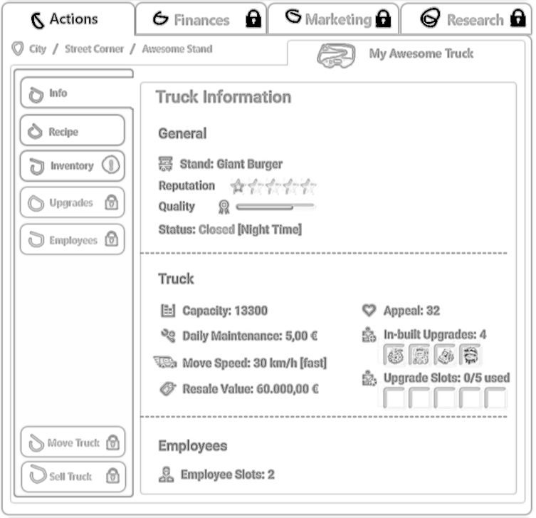
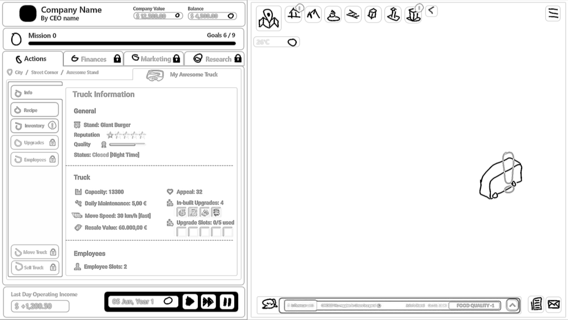
The Action tab contains all stand management functions. It improves readability with better information grouping and a straightforward panel design that offers a user-friendly approach to handling game actions.
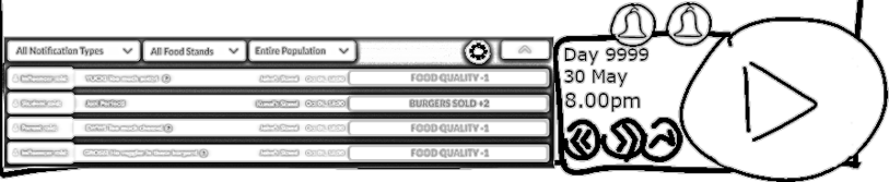
The city view on the right displays the Map and weather data at the top, and the feedback and activity notifications at the bottom.
A map button houses all the localities within an expandable arrow, making it easy to navigate localities from the locality view. Exclamation icons indicate stands and localities requiring action.
The activity notifications and news buttons expand into the environment on click.
From the personalized name card at the top left to thoughtful navigation cues, this version presents a player-centred approach that supports an engaging and intuitive gaming experience.
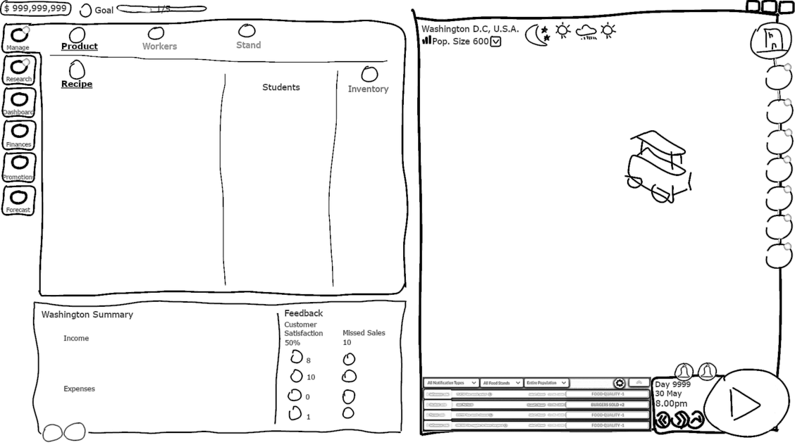
Version 2
The second version utilizes a minimalist approach with a larger environment view. It focuses on essential navigation elements that guide players into the heart of the game.
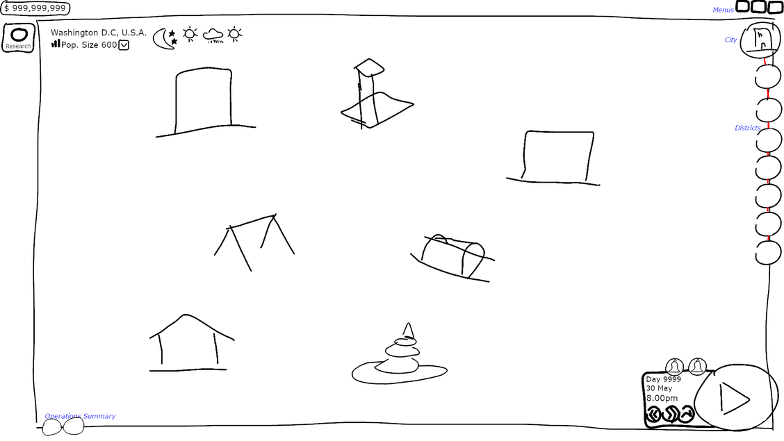
Navigation and Gameplay 🗺️
The primary actions at the left corner provide access to the stand management view, research tree, dashboards, forecasts, finances, etc.
More buttons will appear on the left side as technologies are unlocked.
The primary action buttons dynamically expand on click to reveal panels containing various functions and data.
The environment view collapses into a minimized display on clicking any primary action while maintaining the city and district navigation buttons on the right.
Stand shortcut buttons appear upon hovering on each district, making it easy to jump between stands.
The bottom right hosts the gameplay controls, integrated calendar, feedback notifications, and news. The feedback notifications are displayed as an expandable panel, providing real-time customer feedback updates.
The bottom left holds the operating income and feedback summary information, which is also expandable on click.
This version provides essential information from population details to alert notifications without overwhelming players. It also replaces the large population matrix with numerical representation to save space.
Challenges
Both wireframes offer unique perspectives, with the first focusing on user-friendliness while the second explores minimalist design with dynamic functionalities.
Our challenges include balancing simplicity with detail and ensuring accessibility for visually impaired players.
The questions we are tackling:
- How can we improve navigation without sacrificing detail?
- How can we improve the UI to cater to dynamic font sizes for visually impaired players?
Your insights, opinions, and ideas are crucial to the final design. You can tell us what you think by responding to this email.
As always, we are eager to hear your feedback. 😉
And that’s a wrap for today, Cheers 🥂
Don’t forget to Wishlist the game if you haven’t!
Live Long and Prosper 👋,
Kunal & Team
Leave a Reply